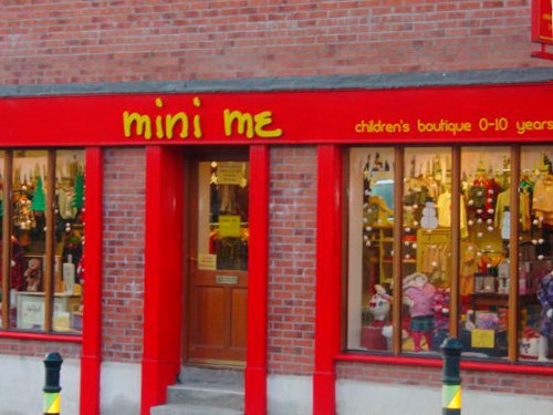
How shop signage can be used to raise awareness of your business whilst respecting its immediate surroundings

Once upon a time, well before the internet emerged, shop owners took great lengths to decorate their window displays. Before the 1990s at least, the window display was like the Amazon.com of its day. Many people go ‘window shopping’ on the internet yet even now, passing trade is a good asset for bricks and mortar retailers. Window displays weren’t enough: effective shop signage came to the fore. Illuminated signs for example; striking typography; greater use of plastics.
Sometimes, modern day shop signage could disrespect the building’s original features, attracting the ire of conservationists and planners. Not to mention residents and fellow traders, critical about a given sign’s aesthetic value. The image of a city, town or village is one concern. The image of the retailer is another perception; what suits a single price retailer may be unsuitable for a purveyor of luxury items.
How to be street smart (and get on with your neighbours)
A well thought out shop sign acts as a suitable advert for your business. Prior to going ahead with the final design, take time to think about how it would look alongside other shops on your street. Will it respect the architectural style and age of your premises? Are there other constraints (for example: Listed Building or within a conservation area)?
One other thing to consider is planning permission. There is more information on the Citizens’ Information website and on the website of your County Council. For example, the County Kildare council website enables you to search planning applications online.
Make sure the shop signage is part of your company’s corporate identity
Brand awareness is a key factor in any successful business. Not only your choice of stationery materials and colour scheme; also the flyers, logos, website, and your bricks and mortar premises. For example, dark green is associated with the DART trains in Dublin. Soon, your clientele will be able to associate certain features of your corporate design with your business.
Though the trains in England, Wales and Scotland have been privatised since 1997, the British Rail double arrow logo remains a strong symbol. How? This was largely due to the Design Research Unit’s approach to the BR corporate image in 1966.
We hope this little post has inspired you enough to think about shop signs a little more. For further information, why not have a chat with us on 045 880603, or send an email to info@signfx.ie. We shall be happy to help you.
Sign FX, 18 January 2017.


